Nusenda Identity Refresh
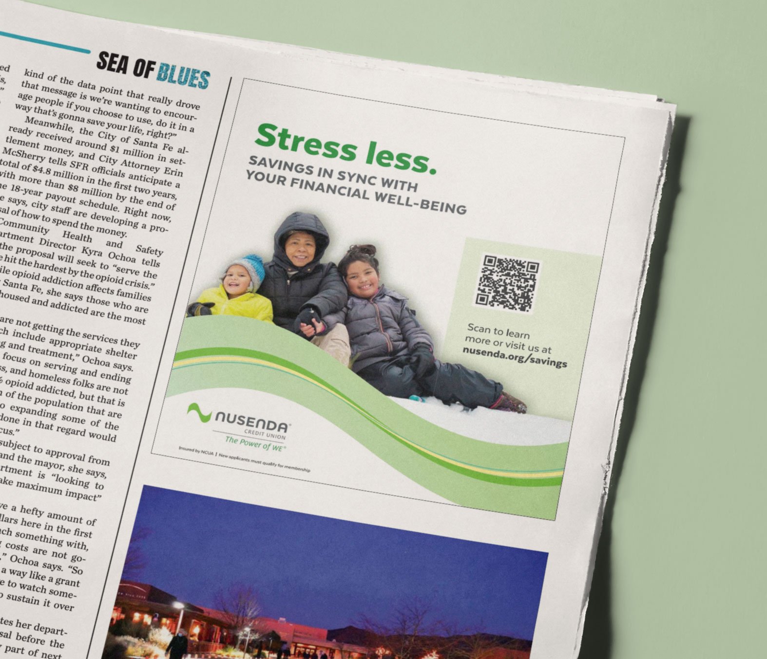
As Designer at Arrow, I led a design refresh of Nusenda Credit Union’s visual identity, and later designed subsequent ad campaigns. A long-standing brand in New Mexico, Nusenda was in need of more dynamic visuals, a color palette with improved accessibility, and standardized methods to apply them. I gave them new, improved ways to visually express themselves, their products and services, and the work they do in their communities. I also delivered clear and detailed brand guidelines that outline how to produce new collateral across print and digital media.
ClientNusenda Credit Union
My ContributionVisual Identity Design
Detailed Brand Guidelines
Campaign Design
Copywriting
Video Art Direction
Activating an Asset
Working off of the existing wave-shaped mark in Nusenda’s logo, I created layered wave form assets to use in photo and video treatments. The colorful, undulating lines of differing widths add movement and interest to collateral, and illustrate the credit union’s involvement in the community.
Made for Motion
The animated wave form makes videos more dynamic, showing how Nusenda products and services reach members in their everyday lives.
Brand Guidelines
Guidelines give detailed instructions on how to use the new wave form assets consistently. They also include messaging, logo usage, visual identity (including an updated color palette with improved accessibility), and rules for digital properties and video production.
Campaign Creative
I wrote copy for and designed ad campaigns for various Nusenda products and services, as well as for general brand awareness. Campaigns included print and digital display ads, OOH, in-branch point-of-purchase displays, and video & radio ads.


