TAA ONE Event Branding
As Designer at Arrow, I led the work on naming, logo design, and visual identity guidelines for Texas Apartment Association’s annual conference and expo, with the ultimate goal of creating a versatile brand identity that is easy to recognize and builds brand recognition for years to come.
ClientTexas Apartment Association (TAA)
My ContributionNaming
Logo & Visual Identity Design
Visual Identity Guidelines
Introducing an Evergreen Brand
Thousands of TAA members look forward to the annual Conference & Expo each year, but the ever-changing name and lack of a continuous cohesive brand meant members would simply say they were “going to TAA” as shorthand. To build brand recognition for years to come, we landed on the name TAA ONE (with ONE standing for Opportunity, Networking, and Education). It’s easy to remember, easy to say, and encompasses all that the conference offers.

The Logo
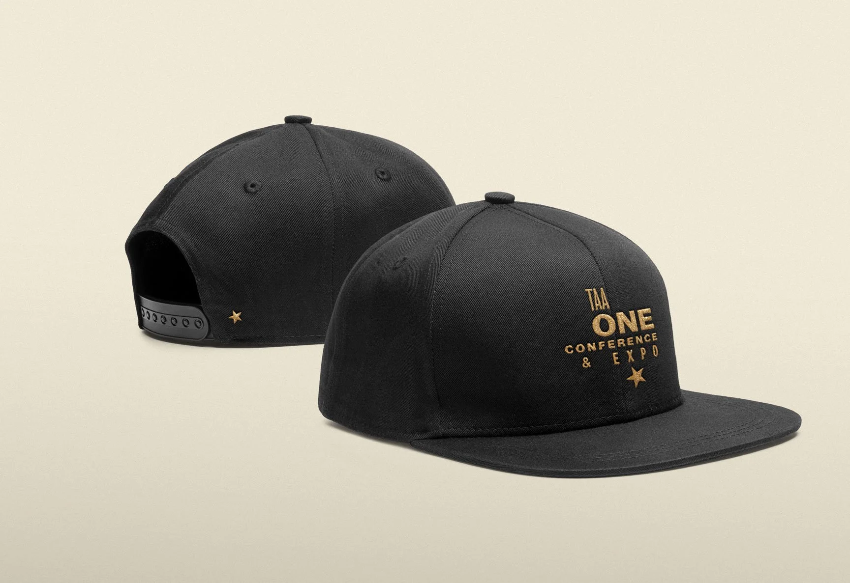
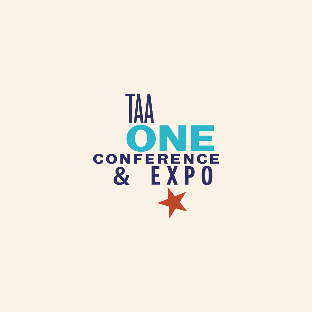
The logo consists of a customized wordmark and star graphic. The star tilts at a familiar angle, reminiscent of the angled star in the TAA logo. The combined form creates a Texas-shaped silhouette, and the different weights and widths of type, combined with the star’s tilt, exude a “Texas swagger.”
The tilted star from TAA’s primary logo anchors the TAA one logo.
Adaptable Color
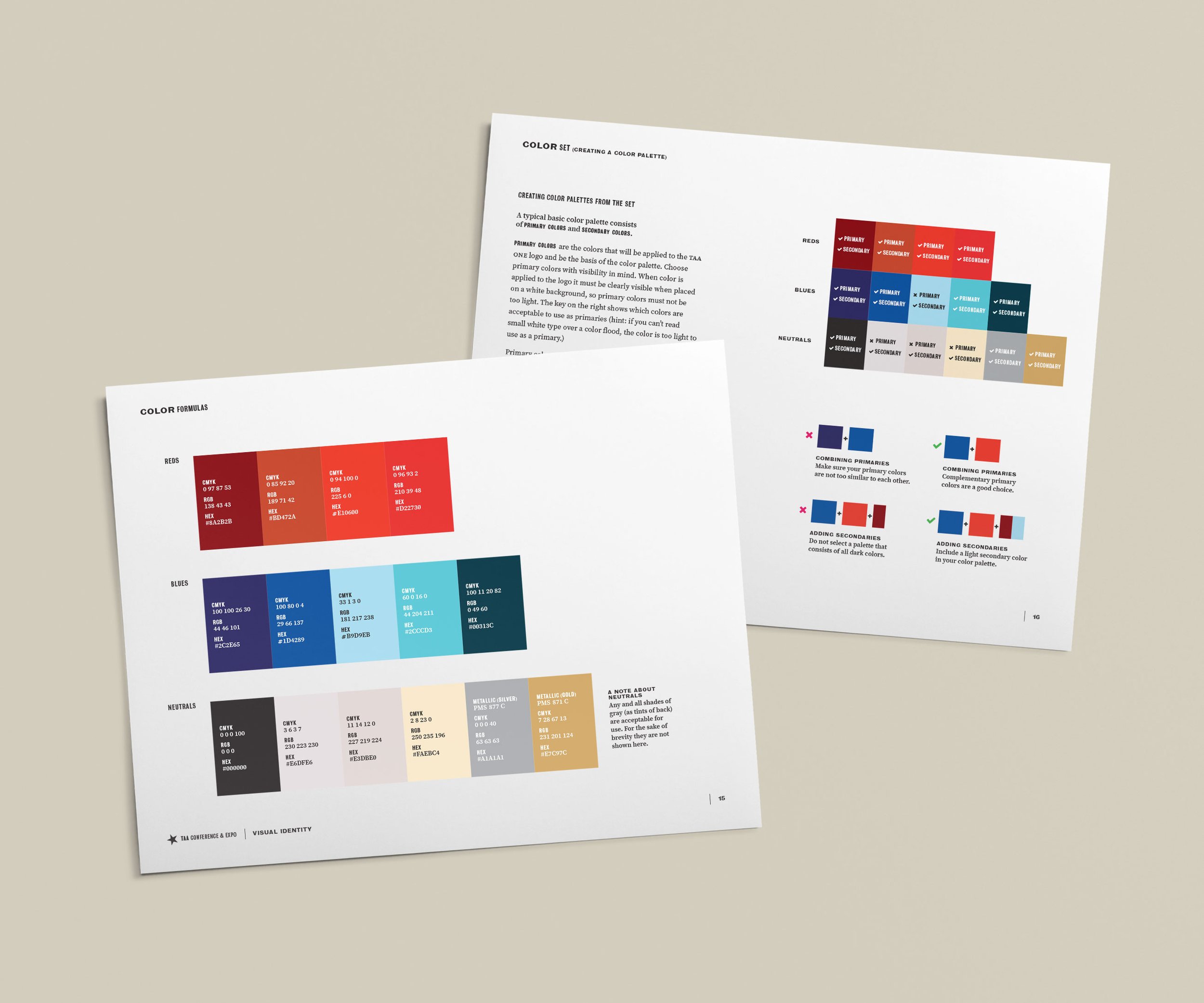
I also supplied them with a wide-ranging set of complementary and harmonious colors to ensure fool-proof palette creation and versatility for conferences in future years.
Bold Messages
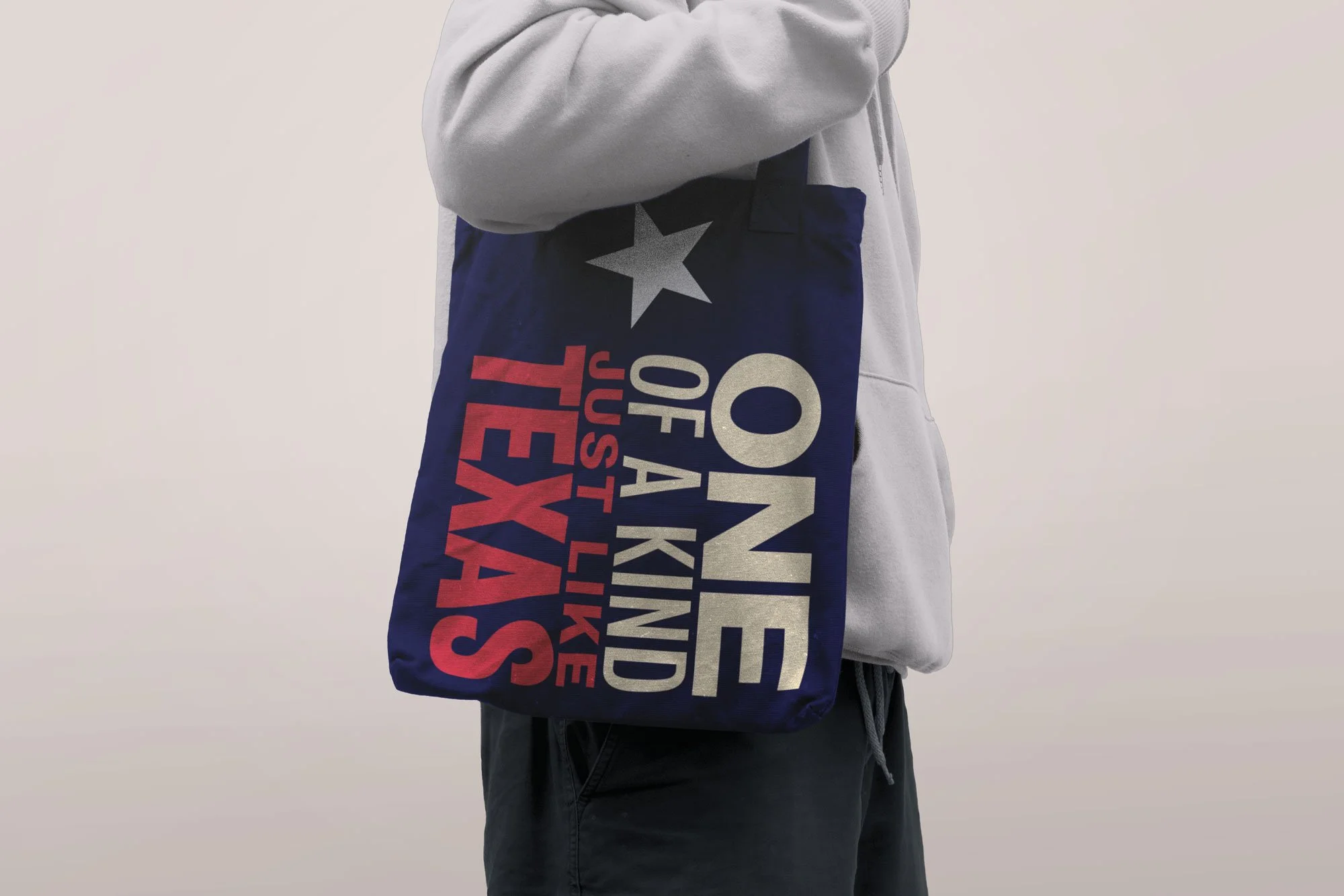
The brand display typeface, Bureau Grot, comes in a wide variety of widths and weights, ensuring a multitude of ways to wield it over the years. Combining these widths and weights together is a key component to the brand look and voice.


